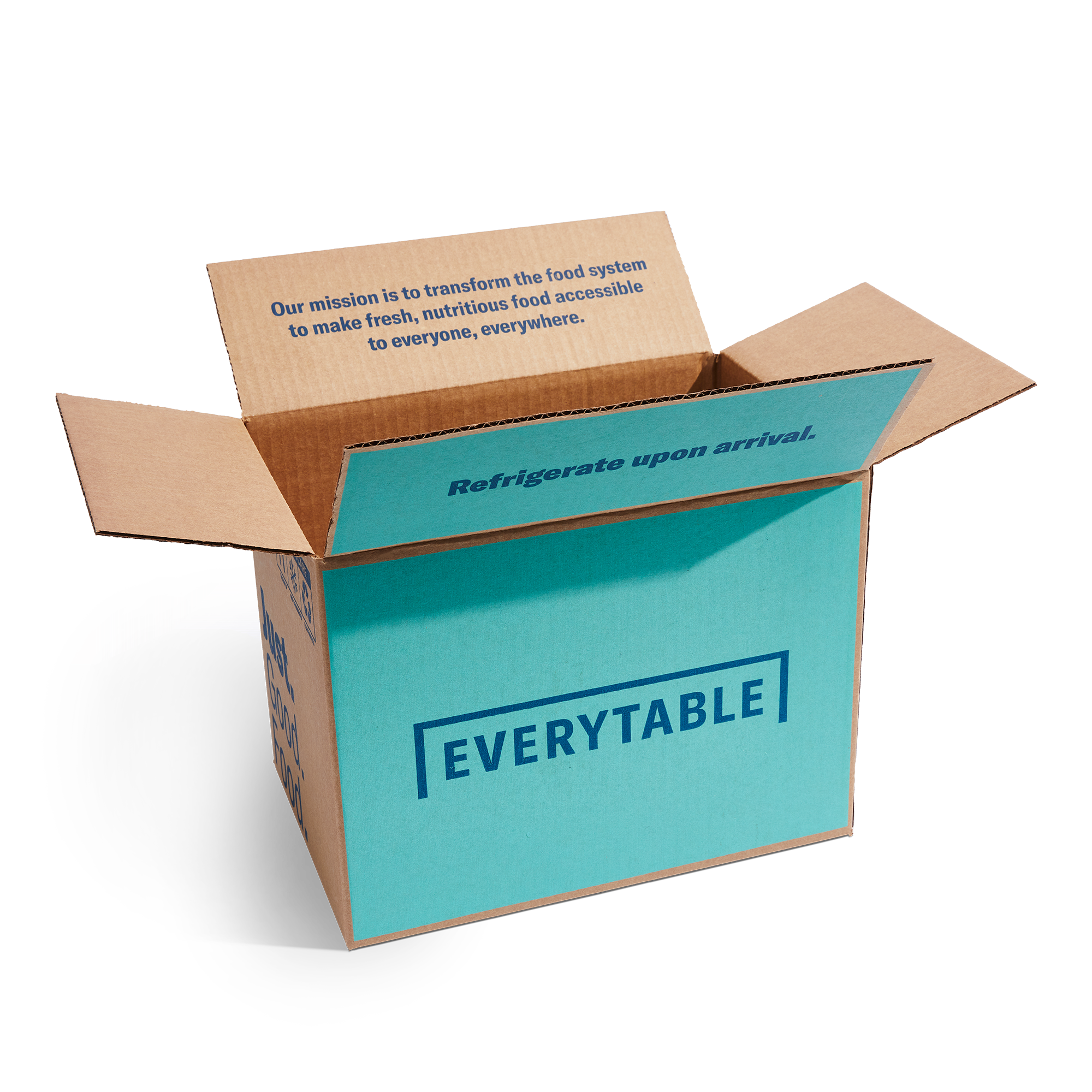
Everytable is a grab & go food concept based in Los Angeles, California whose mission is to provide healthy and affordable food available to everyone regardless of zip code.
Job Title: Creative Marketing Manager | My Role: Art Direction, Brand Identity, Photo Production, Creative & Brand Strategy, Graphic Design, Packaging Design, Store Design
PRODUCT PHOTOGRAPHY
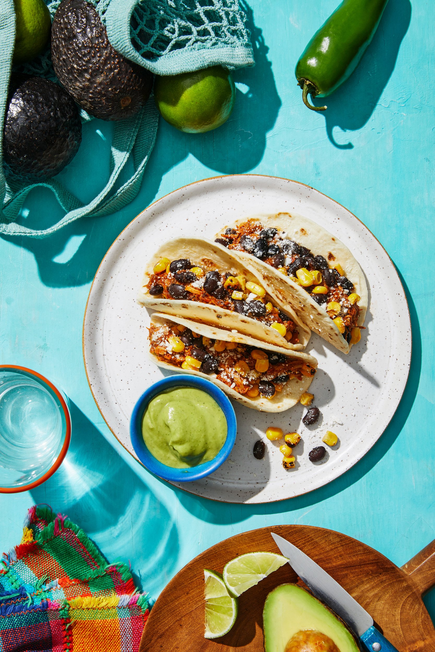
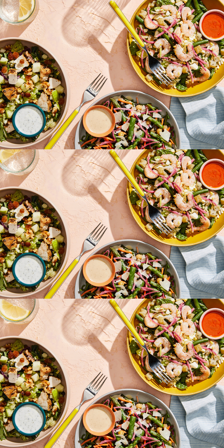
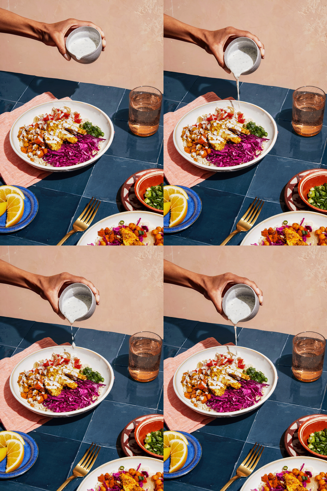
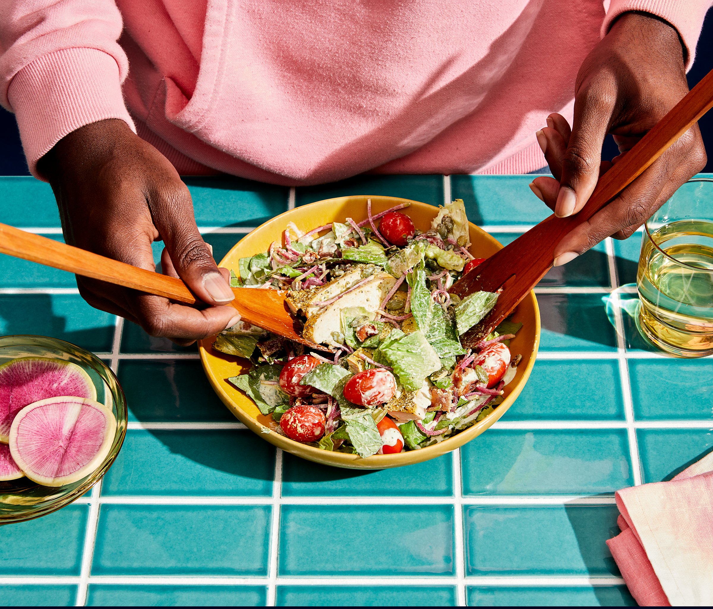
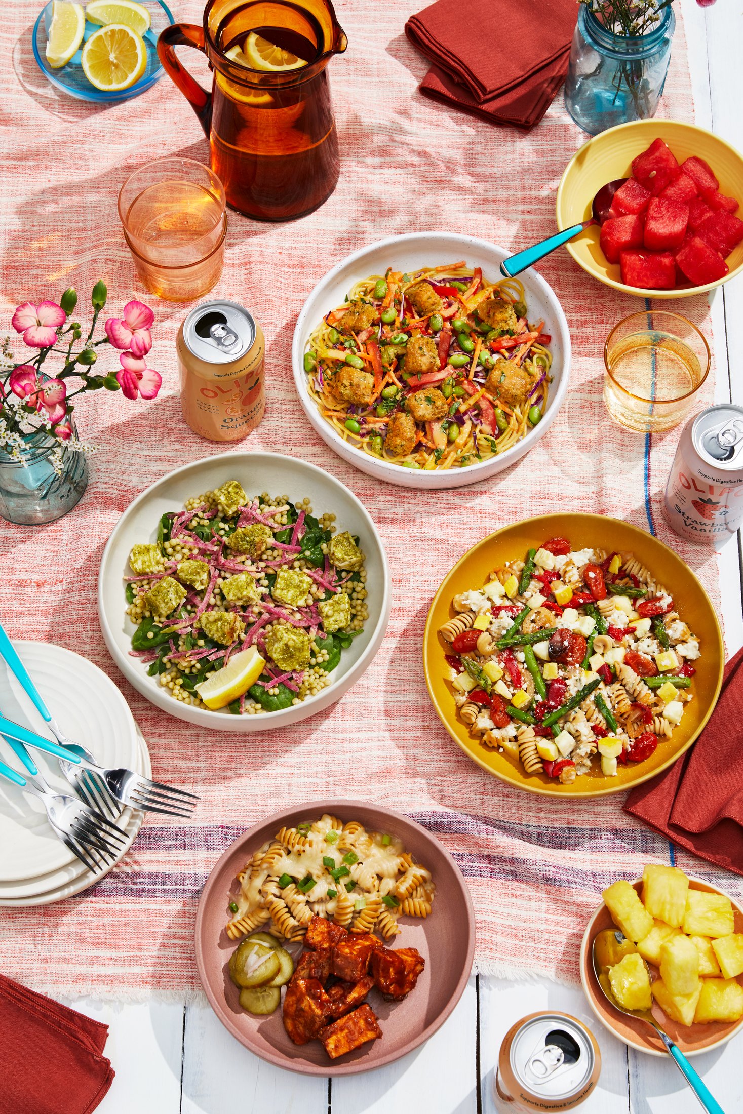
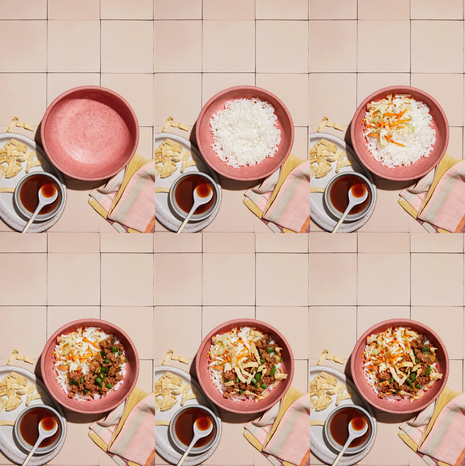
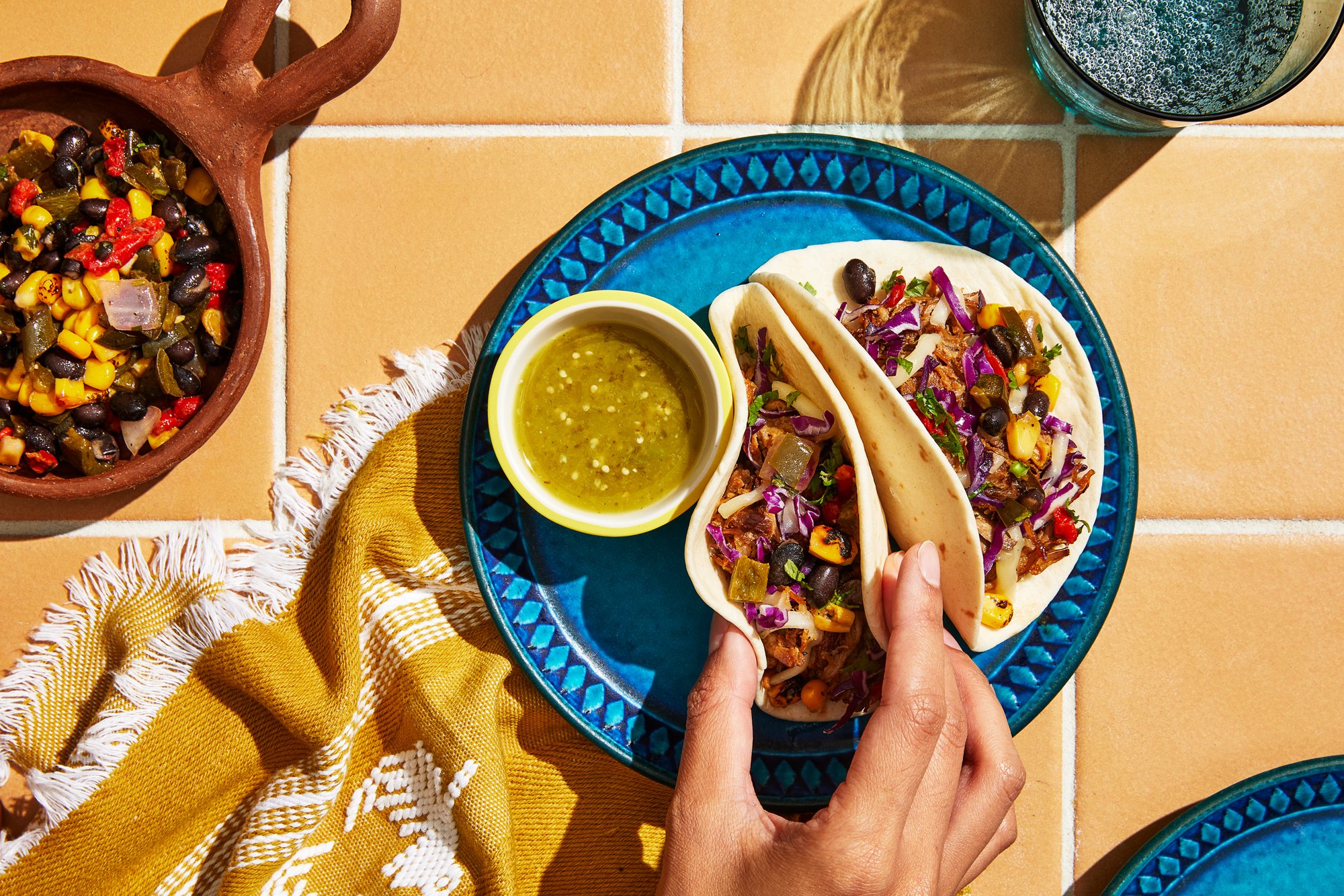
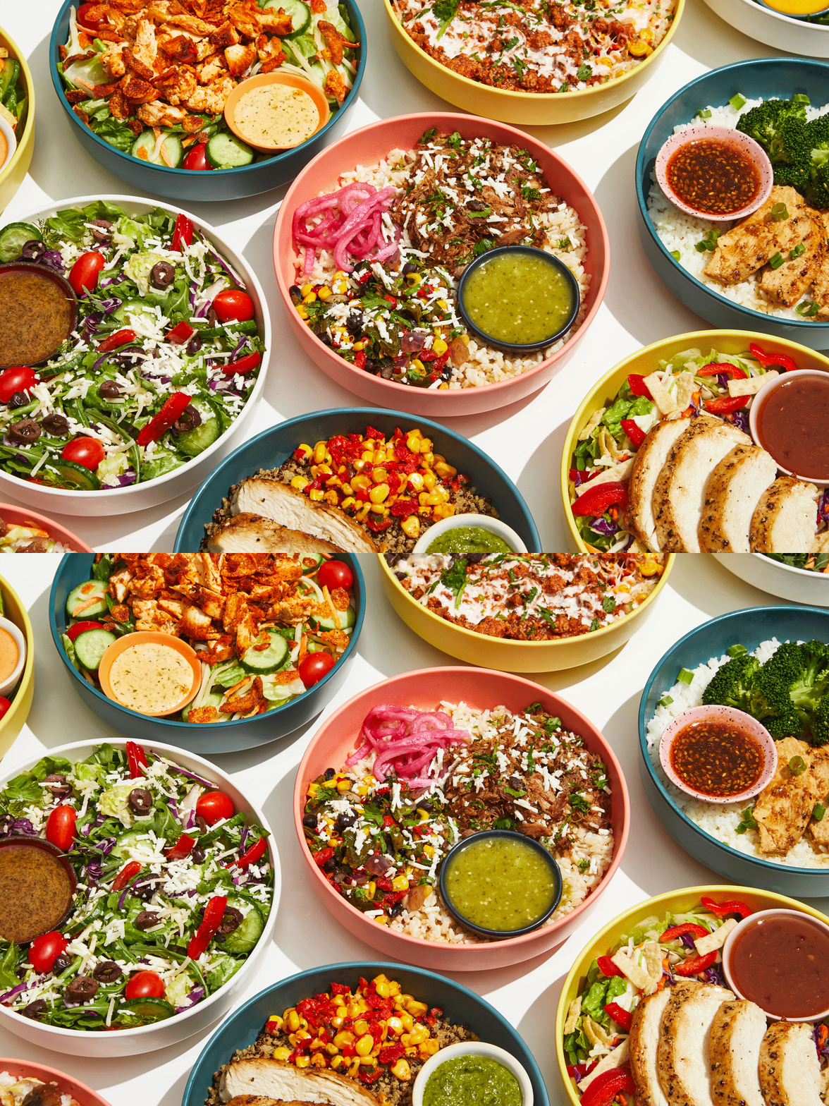
Photo Art Direction
Each month I was in charge of coordinating and art directing a 10-hour photoshoot that highlighted new menu lines, people enjoying our food, and everything in between. From coordinating and hiring to picking color schemes and collaborating on props, I was invested in every element of our photography process.
Photos by Erica Allen












OMNI-CHANNEL MARKETING
Menu Expansion
Everytable launches new recipes every month but the real gains are made when we launch new product lines and add layers to our menu. As the leading creative, I consistently played a pivotal role in crafting the visual narrative for each menu launch, overseeing the end-to-end creative process. My responsibilities extended beyond the realms of design to strategic thinking, where I meticulously aligned the creative vision with launch timelines, product specifics, and overarching menu strategy.
From digital platforms to in-store touchpoints, my role encompassed the creation of a cohesive and visually striking look that not only captured the essence of each menu launch but also resonated with our diverse customer base. The success of each launch was not just a measure of its visual appeal but also a testament to the strategic approach I employed, ensuring that the creative elements seamlessly integrated into the overall marketing strategy.
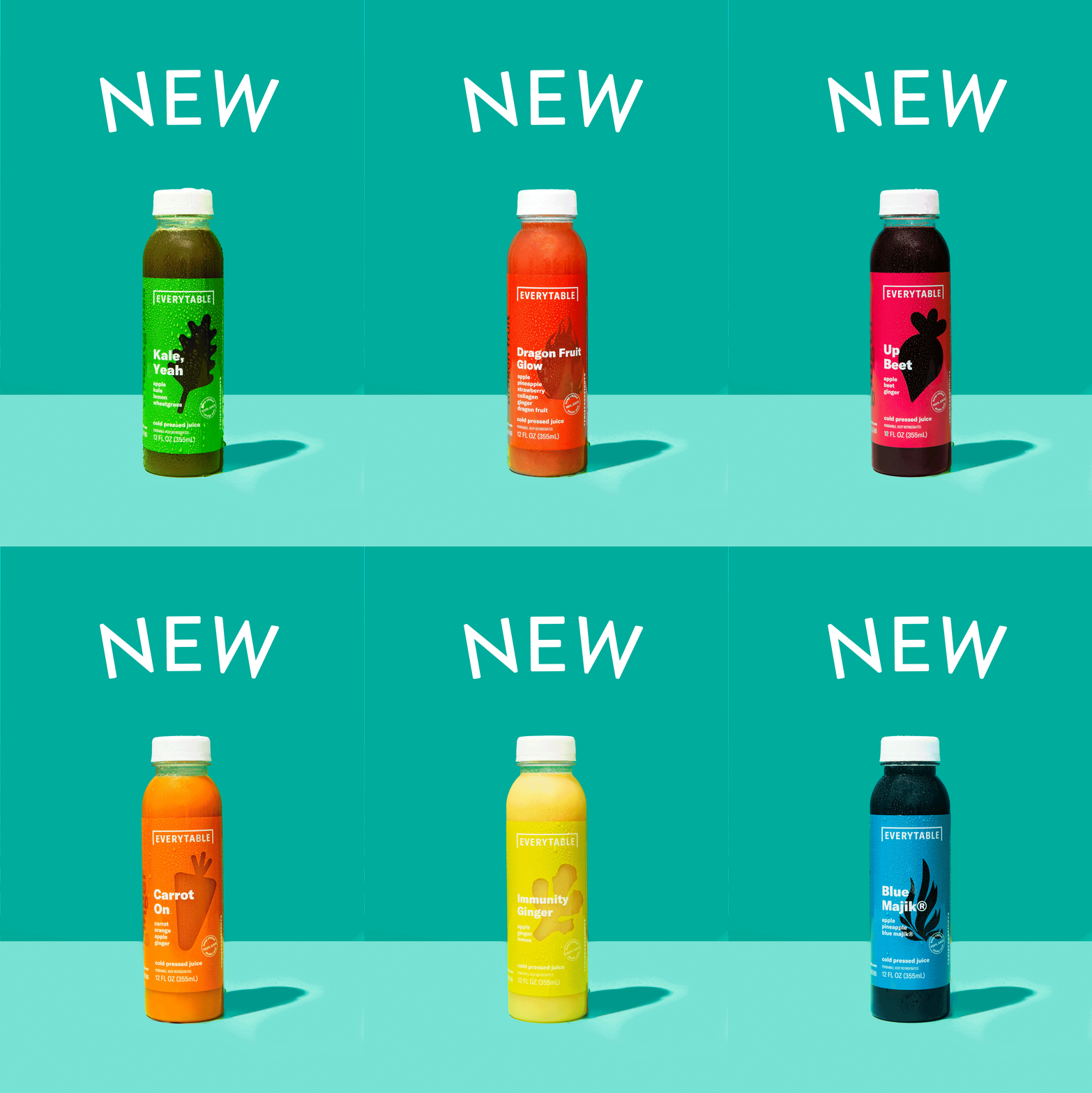
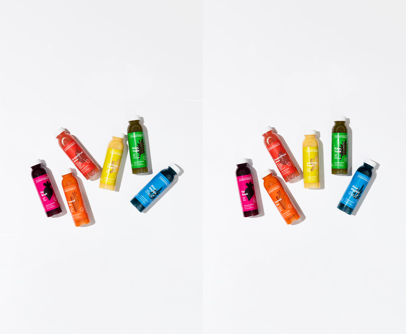
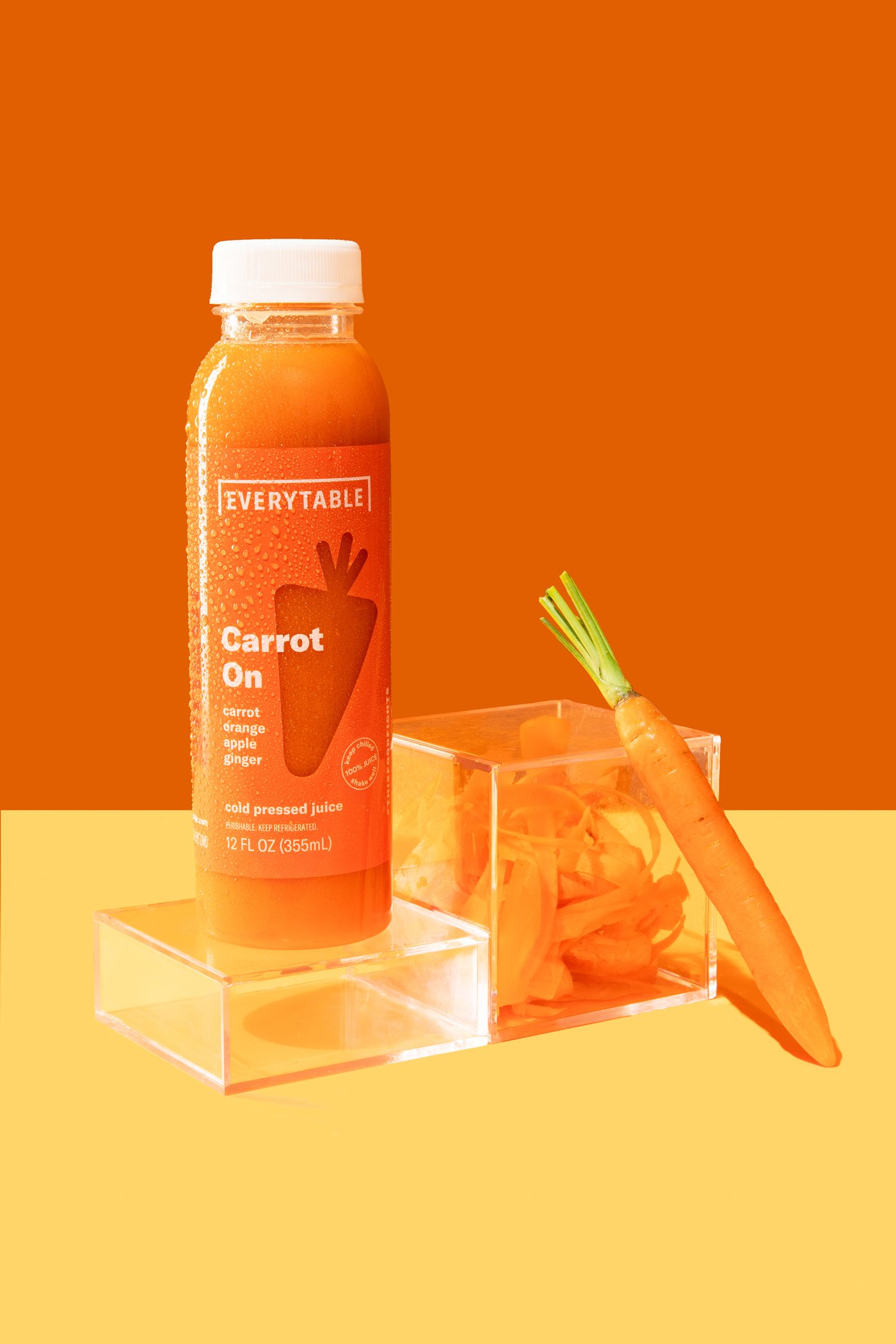
01. Fresh Juices Launch
Themes: Freshness / Colorful Ingredients / Health & Wellness
Color Palette: Bright + vibrant
Key Consumer Insight: These products target customers seeking immune-boosting + healthy beverage options that are convenient and affordably priced
Competitive Landscape: The juices strategy is in line with key competitors which offer nutrient-forward functional fruit and veggie juices
Marketing Initiatives: Email Marketing, In-Store Assets, Digital ads, Juice Bundle Promotion





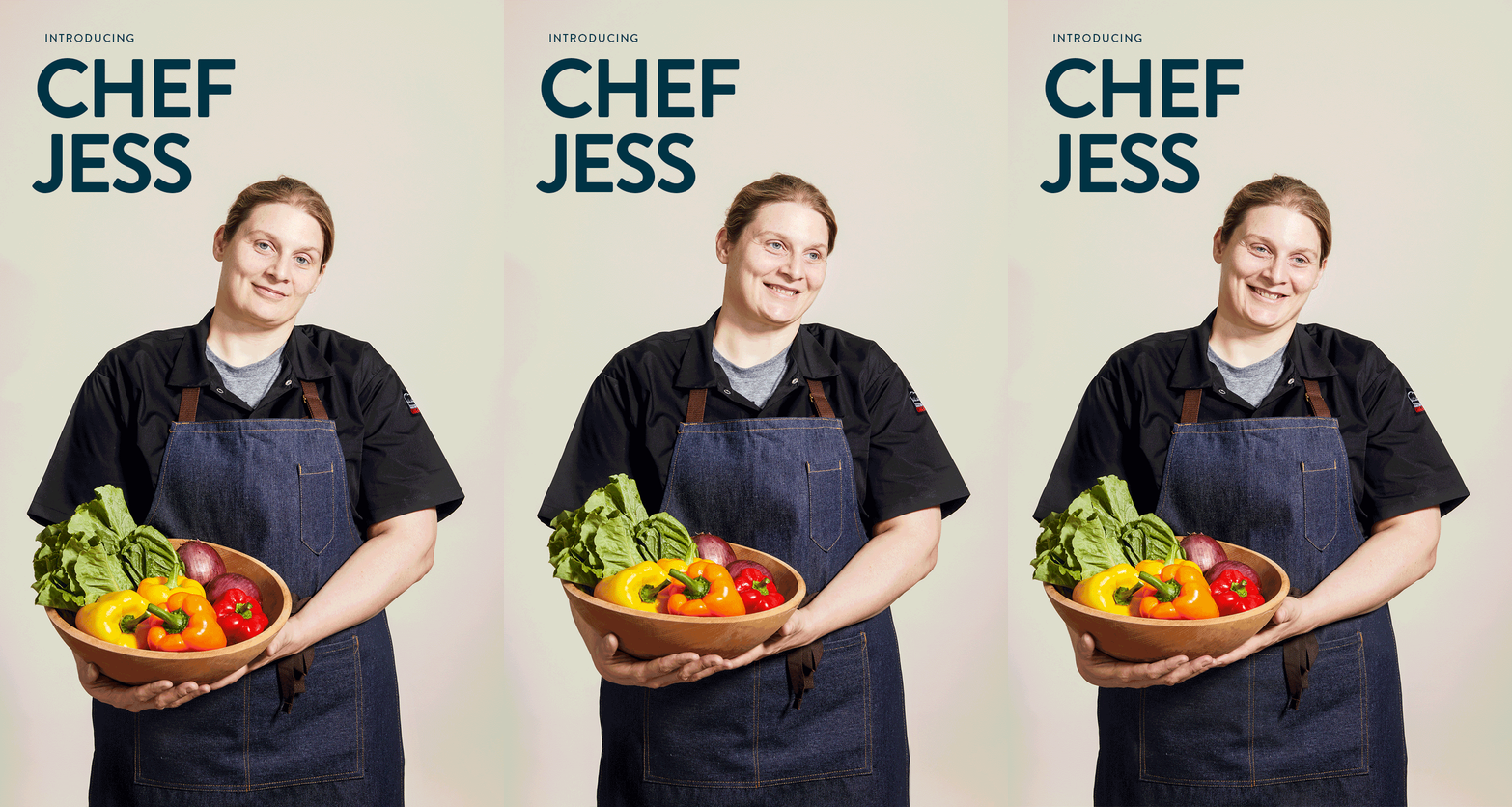
02. Superfood Bowls
Themes: Freshness / Colorful Ingredients / Health & Wellness / New Year Resolutions
Color Palette: White / Beige / Midnight / Highlighted by colorful fruits & vegetables
Key Consumer Insight: Targeting both existing and new customers, our Superfood Bowls attract a younger audience (Gen Z and Millennials) that are looking for healthier options that are both convenient and affordable.
Competitive Landscape: While both fast-casual and QSR are taking steps to improve their health halo and use higher quality ingredients, our key competitors have not focused broadly on a line of Superfoods. Broadening our menu to include these items helps set us apart as more health-conscious and credible as a culinary leader.
Marketing Initiatives: Email Marketing, In-Store Assets, Digital Ads


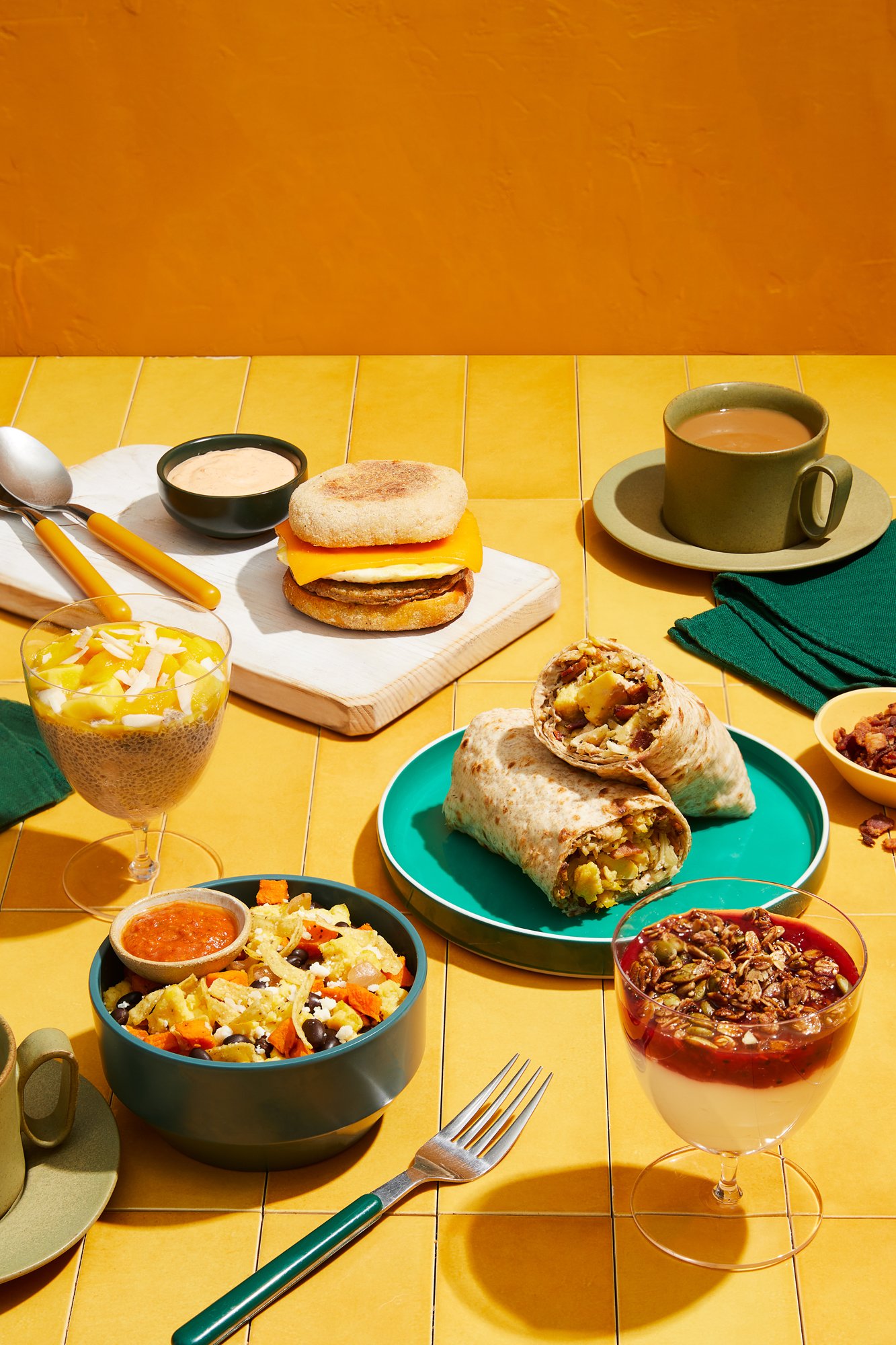
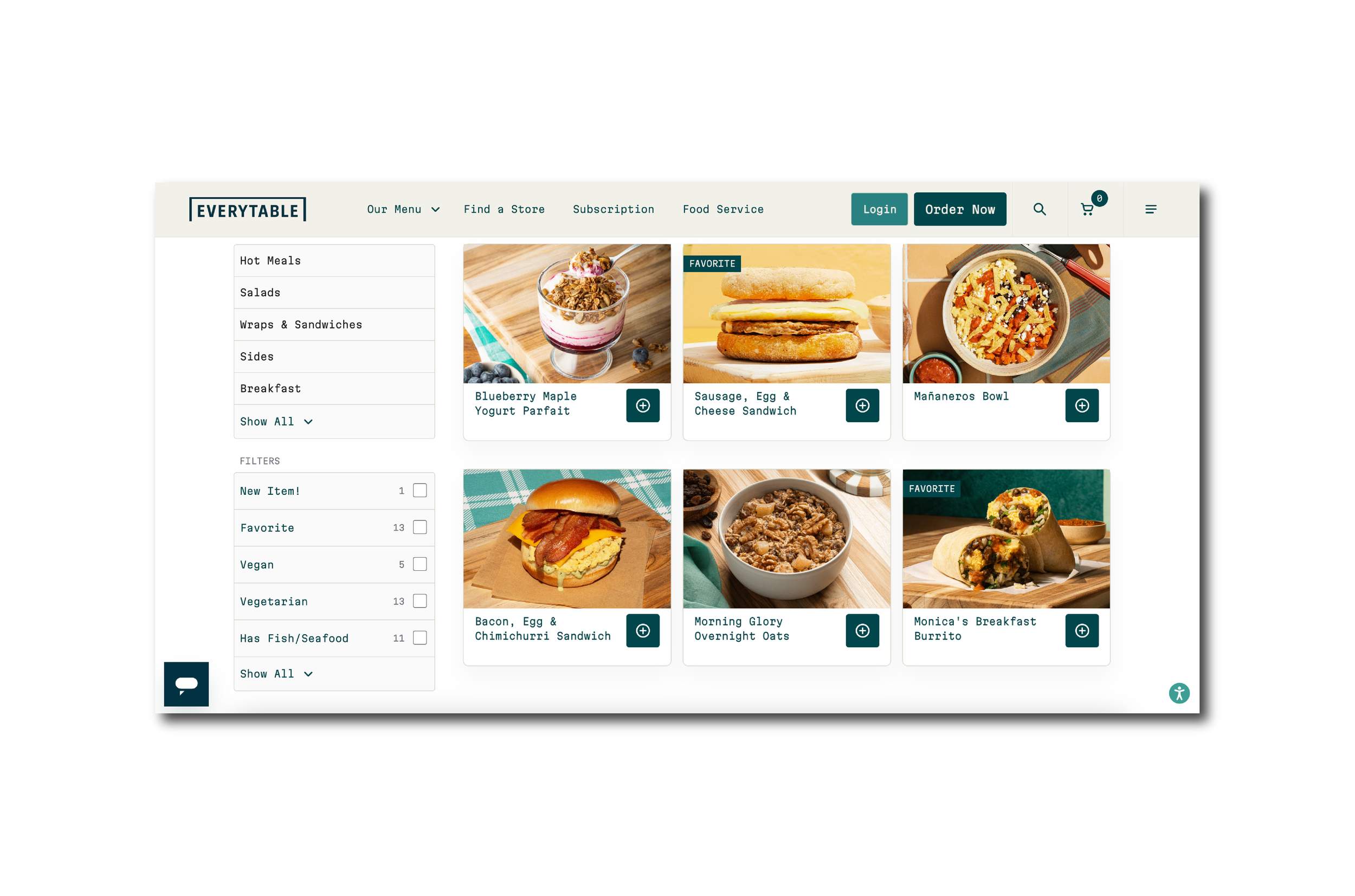
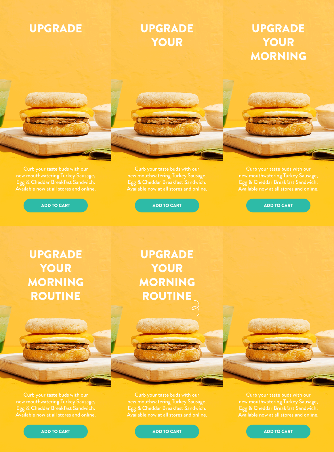
03. Breakfast
Themes: Warmth / Comfort Food
Color Palette: Warm + bright
Key Consumer Insight: This is part of a company-wide initiative to expand the morning daypart and position Everytable as an all-day destination/solution for our customers (morning, afternoon, evening).
Competitive Landscape: The breakfast line strategy is in line with key competitors which offer more portable, convenient handheld options (hot sandwiches + burritos), as well as parfait cups
Marketing Initiatives: Email Marketing, In-Store Assets, Digital ads


BRAND IDENTITY
Branding & Design
Since 2016, the Everytable brand has been growing and it was time the visuals caught up. As with most brand refreshes, it was important to update the Everytable look without alienating current customers, and without removing current brand equities. A new color palette balancing cool and warm tones, clean and modern fonts, and playful accents completely change the vibe while still leaving plenty of space for the product to shine.
